Charts
The Charts section provides visual summaries of course users based on selected profile fields.
By default, the system can display charts based on the Country field. It can also display charts for any custom user profile field you create, as long as the field type is dropdown.
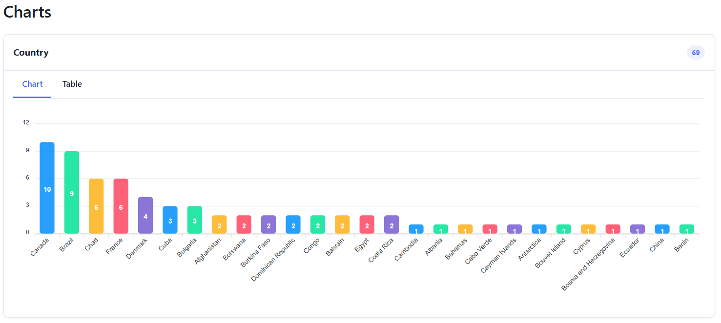
Supported Chart Fields
Charts can be generated from:
- Country field
- Custom dropdown user profile fields
Chart Types
You can choose from the following chart types:
- Bar chart
- Pie chart
- Donut chart
Chart and Table Views
Each chart can be viewed in two formats:
- Chart: Displays the data visually using the selected chart type.
- Table: Displays each option value with its corresponding user count and percentage.
You can switch between the Chart and Table tabs at any time.
You can export the data for each chart to Excel in the table view. The exported file includes the option values, user counts, and percentages and respects the active report filters.
Chart Order
You can also change the order in which charts appear. This allows you to organize the most important charts first and customize the reporting layout based on your needs.

Purpose
The Charts section helps you understand the distribution of users by country or by any selected custom dropdown field. This is useful for monitoring course participation, audience profile, and user segmentation.
Was this page helpful?